Gmail UX is a mess
Is anyone in charge?

"Just look at Google's products as a guide" is a common refrain in product circles.
But are Google's products actually well designed? Let's look at Gmail. With 2.5 billion active users, it must be brilliant, right?
First of all, why are there two of these?

I initially thought the top row was for inbox actions and the bottom row was email but that’s not true.
What's in them?

Mark as unread and Filter messages like this/these is available twice in different places. Unusual decision, although I’m not sure why there is a subtle difference in wording. They both do the same thing.
And what's the difference between an important email and a starred email? You also have categories and labels, how does this relate? From what I can tell it’s all independent.
What about the header?

Here we can:
Archive. Fun fact: when this feature was invented, only the engineer in charge of this feature and God knew where this button sends your email. But after so much time has passed, now only God knows.
Report Spam and Delete - also available on the bottom hamburger menu
Mark as unread - available in all three places
Snooze, Add to tasks, Move to, Labels - new options!
The fun thing about move to and labels is that they do the same thing. The only difference between the two options is that move to applies one label and labels lets you apply multiple labels. What happens if you have an email with multiple labels and “move it” to another label, does it retain the original labels?

But of course you shouldn’t confuse labels with whatever this is.

And what's up with these icons? Can they just pick a theme and stick with it? Either do monochrome or color.

Speaking of colors, does anyone think this looks good?

Here's a sensible color theme for comparison:

Gmail here has no consistency, across colors and styling. This is a common theme with their products - a lack of higher level vision or design. Somebody had a project to introduce categories, but labels already existed, so now we have both. Somebody reviewing google help desk forums found people can't find the filter email button, so they added it in three places. Now just sprinkle on some Gemini AI and you should be all set. Speaking of AI:

Product is hard. To churn out a reasonably well designed product, I found you need three things:
Fast Iteration
You need to react to how people are using your product. If you have design by committee or a slow release process, you'll be at a great disadvantage.
Google recently redesigned its sign in page. They made a big splash about it, likely devoting months of effort and thousands of man hours on this redesign.
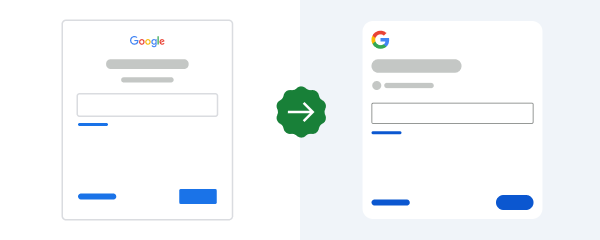
The last time they refreshed it was 2018, so it looks like we can expect our next release in 2030 where they further alter the border radius of the buttons.

If this is your process for something as simple as updating some CSS parameters, you're unlikely to lead in product. I get that the product is distributed to billions of users, but there's no reason to believe this tedious development cycle is actually better than a faster one. And I’m convinced it’s contributing to the product issues with Gmail persist.
Someone who cares / ownership
The other thing you need is someone who cares and can make a decision. This is tough in an organization that has tens of thousand of employees. I'm sure there are people at Google that know the design of Gmail is a mess.
But I don't think any one person has ownership of the product that can initiate a redesign. Why stick your neck out? You have literally 30% of the world on your product. Why try to make it marginally nicer? Even that would be preferable to the patchwork changes we see that results in things like three places to mark an email as unread.
Taste
Finally, you need taste. In a 1995 interview, Steve Jobs said, "The only problem with Microsoft is they just have no taste". Jobs believed Microsoft missed the point by thinking design was just about fashion or surface appearance, saying they would just "slap a little color on this piece of junk computer, and we’ll have one, too".
This might be overstating it. I don't necessarily want my email client to have taste. I just want predictability. I don't want multiple buttons that do the same thing. I don't want things hidden away and a bunch of features I never asked for. I guess what I want is the absence of bad taste.
Product is a craft. No product succeeds simply because it looks nice or has good UX. It helps but there are plenty of products that have great design and fail and vice versa. But shouldn't we have nice things?